When Delish launched in 2015, the food media world was very different. To become the most fun food website on the internet, the team had to get creative … and scrappy. Before the brand even had a kitchen, early food editors photographed their creations with their phones on the floor near a window. The team eventually moved into two 350-square-foot basic kitchens, where over the next seven years they developed thousands of recipes and shot countless photographs and videos. And after publishing all of these incredible recipes and videos (and winning the love of millions of followers), it was official—Delish needed a new home.
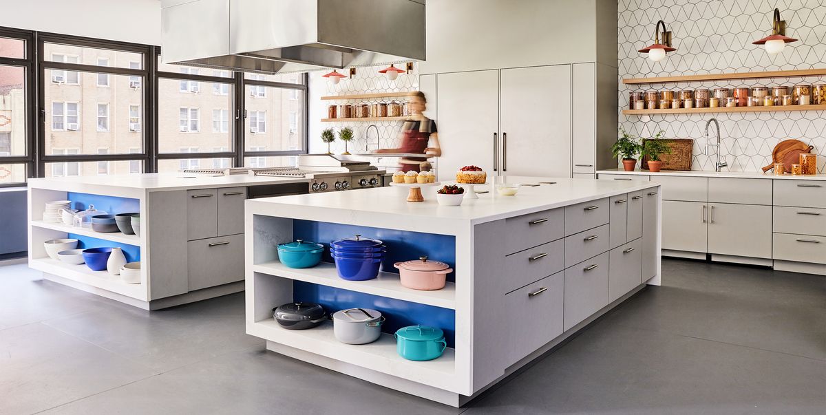
Enter the newly opened Delish Kitchen Studio, a 3,000-square-foot space designed to deliver even more of the amazing recipes and videos that built Delish into one of the biggest food websites on the internet. The team worked with the architecture firm Gerner Kronick + Valcarcel, Architects, DPC in partnership with Jacobs Doland Beer, a New York City-based design firm, interior designer Betsy Wentz, and sponsors GE Profile, GoodCook, and The Bar to create a studio with four distinct areas to produce recipes, photos, and videos.
Delish Editorial Director Joanna Saltz says she and the team really wanted to create a place that was extremely functional but didn’t feel too pretentious. “Our team is like the most fun mix of people—people who come from all different background and care deeply about food, but who all love to laugh and to think differently about cooking. So the kitchen needed to be a place where we could get inspired and do great work, but also have that creative spirit running through it. We weren’t interested in a massive, factory-like test kitchen; that just isn’t us.” Read on to learn more about each area of the studio.
Test Kitchen
The biggest goal with the test kitchen was to create separation between food editors who needed to test and develop recipes and food editors and content production crew that needed to shoot photos and videos. “Our old test kitchen was windowless and tiny,” says Makinze Gore, Delish’s senior food editor. “If I was trying to test a recipe while a photo or video shoot was happening, we were constantly bumping into each other and had to get creative on counterspace to make it work. Having a big open space that’s actually designed for multiple people cooking at once, and to have natural light is so wonderful! It feels like a sigh of relief.”
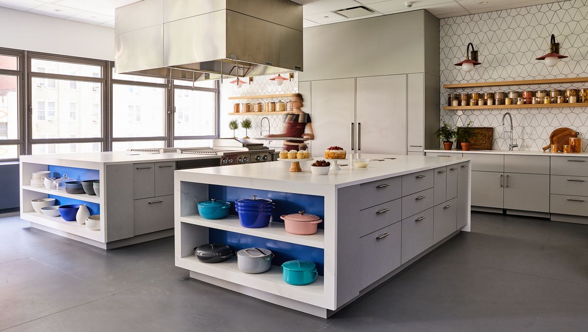
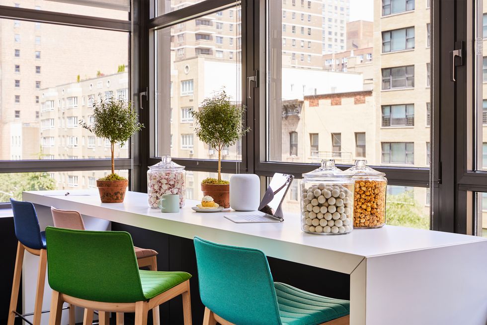
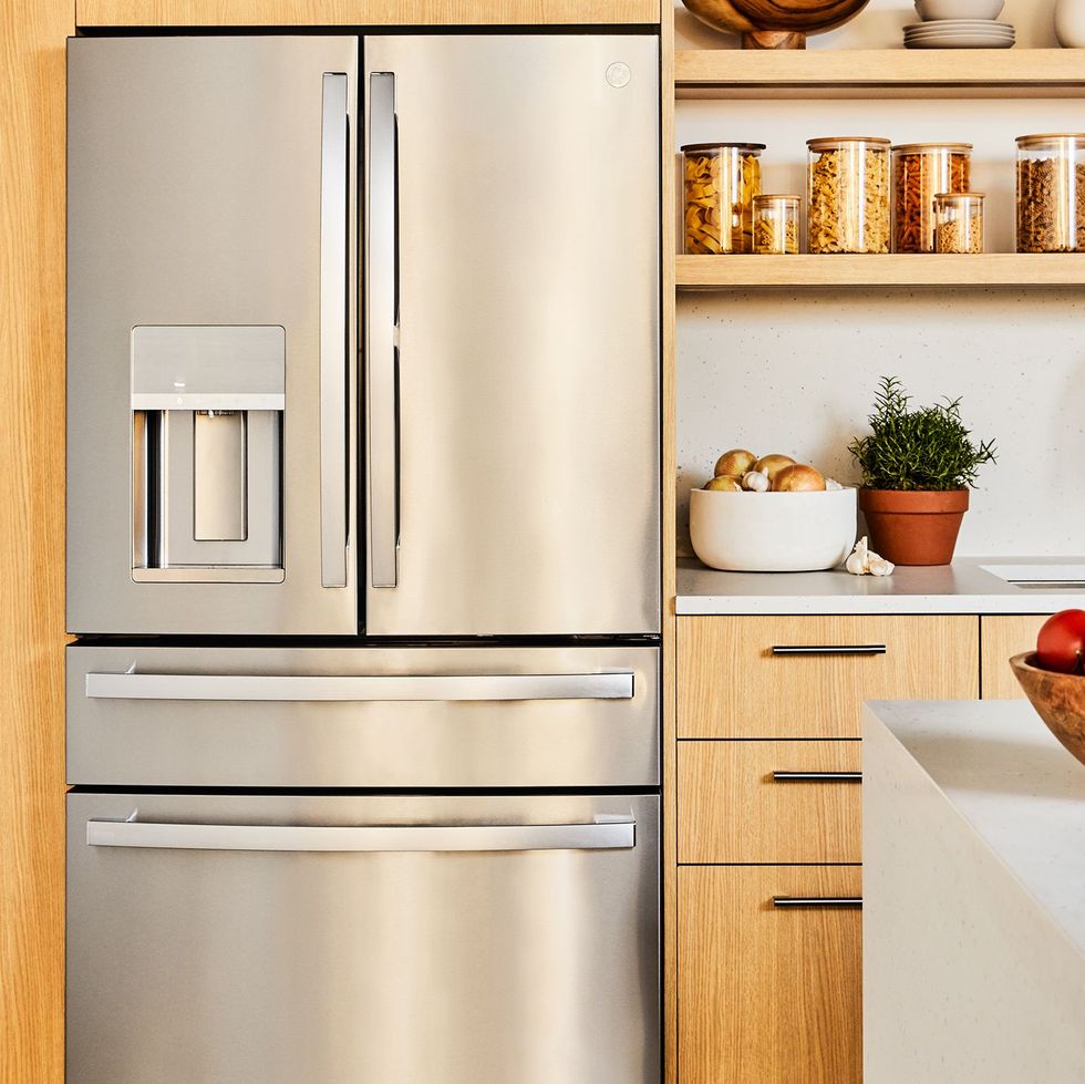
This was also where interior designer Betsy Wentz brought in some personality—colorful Andreu World stools, whimsical Fireclay Tile, and distinctive The Urban Electric Co. light fixtures all adorn custom cabinets and Caesarstone countertops to make for a truly special place for the team to work. Not to mention smart solutions like end-cap island storage (perfect for display-worthy cookware like a 4-piece Staub stackable cast iron set), slots for rolling racks, built-in spice storage, and iPads and HomePods for recipe notes, inspo, kitchen timers, and music. There’s also a high-top table for editors to shoot video near the windows to take full advantage of natural light, plus space for non-food editors to work, chat, and sneak a bite from the kitchen team. “Delish Kitchen Studios was designed to feel both fun and approachable, but also clever and nimble—we want to be able to create quality, multimedia content at the drop of a hat,” Saltz says. “It’s Michelin-quality appliances wrapped in TikTok-level cheer.”
Kitchen Studios
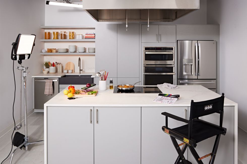
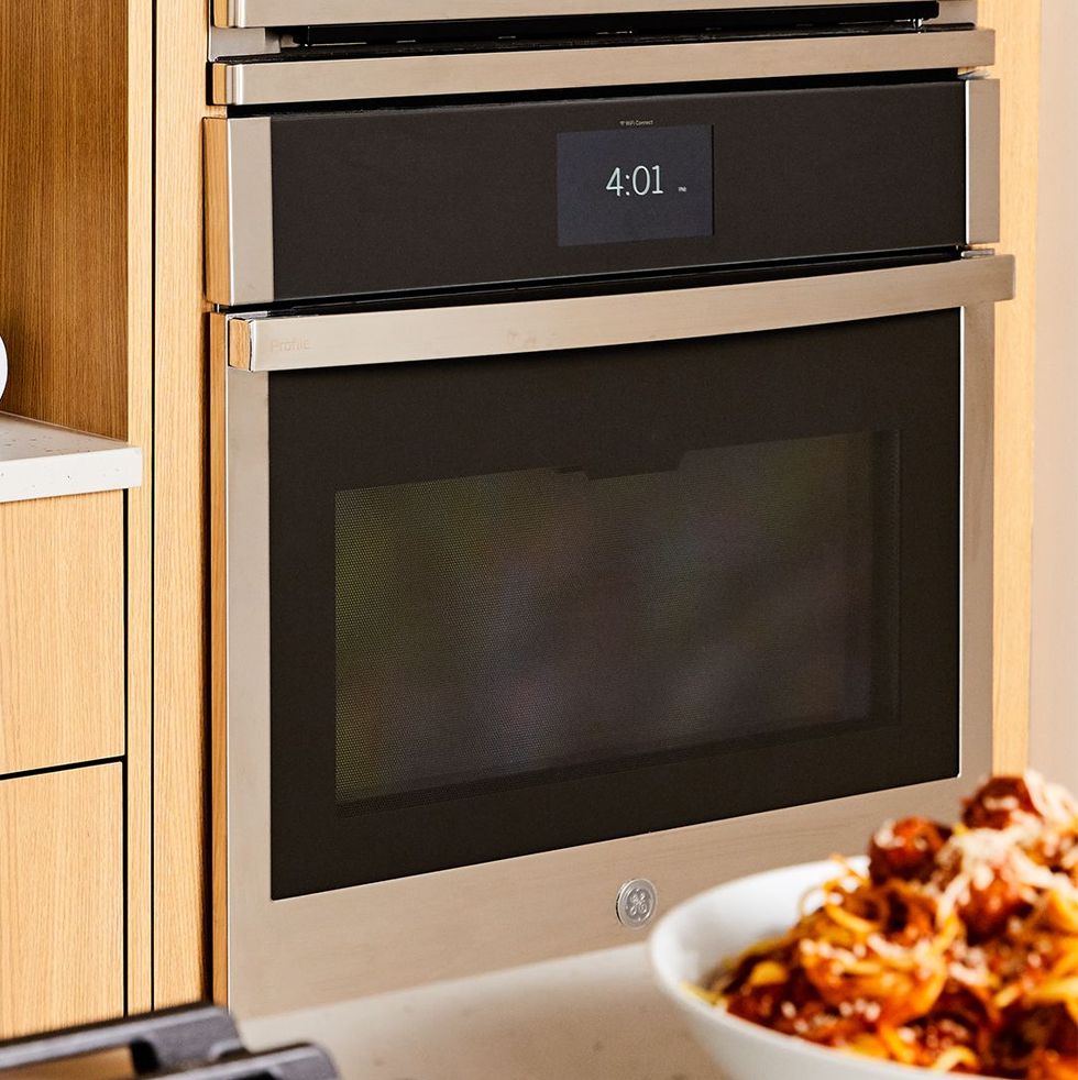
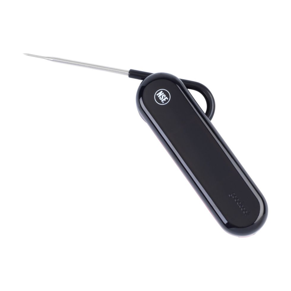
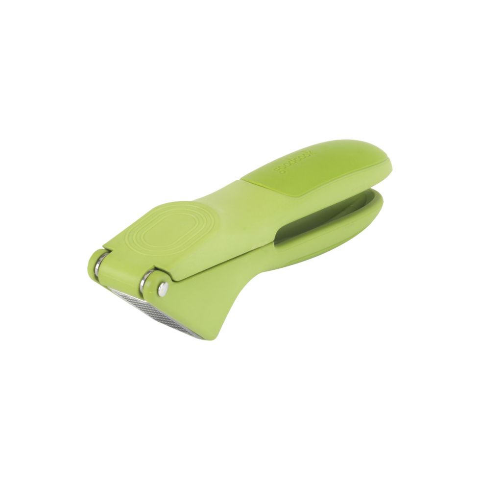
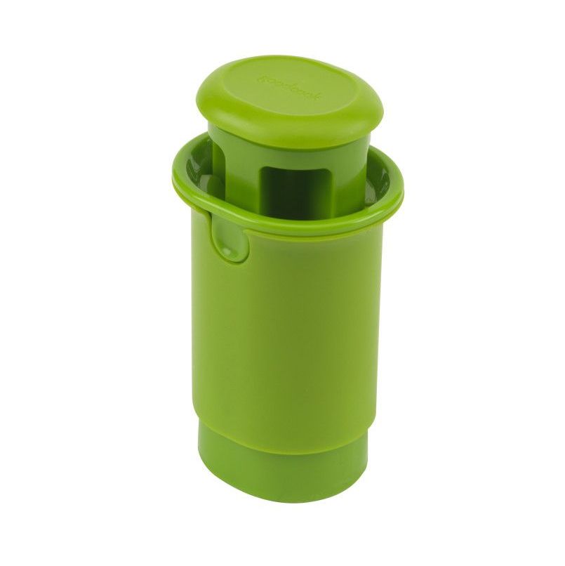
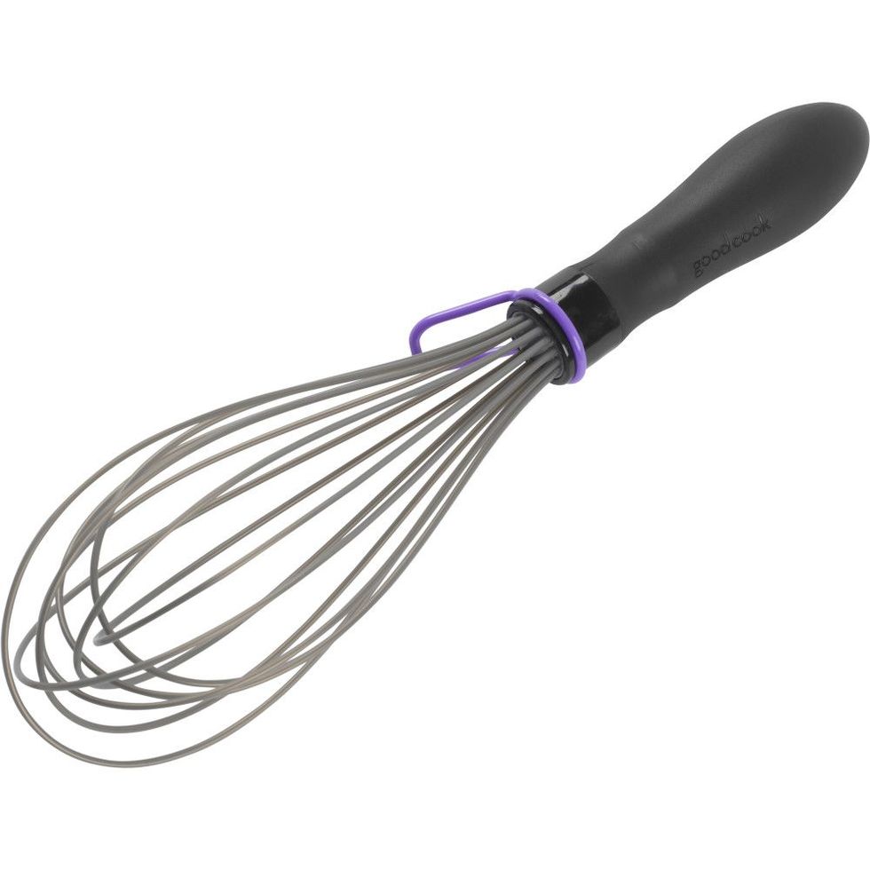
For the three content-production studios, the Delish team wanted a homier feel. In the kitchen featured here, a mobile portion of the island lets our cameras access all sides of the studio. And the GE Profile wall oven even has an CookCam that allows Delish editors to watch livestreamed video of their food on their phone—no more opening the oven door before it’s too early.”We really wanted to create a place where on-camera talent, and the food team, could feel at home,” Chelsea Lupkin, Delish’s director of photography, says. “Previously we weren’t able to work with more than a few people in it, and forget about having a full crew in there. Now, we have room to move cameras and lights, while giving talent the space they need to do their thing.” Food Processor: GE Profile. Kitchen gadgets: GoodCook. Glass storage containers: Amazon. Dishware: CB2.
Event Space & Bar
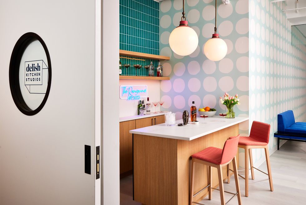
Delish is all about a good party, so it was essential to make room for the team to gather. “We had a real space issue in our former kitchens, which inhibited output and efficiency, and did not allow us to invite the full team and friends in the building to taste our food,” Robert Seixas, Delish’s food director, says. “The new kitchen gives us ample room to gather and discuss our recipes, while also being a good spot to have a cocktail during events and happy hours.”
This area features a dining table and chairs large enough for meetings or full tastings. The bar is the perfect backdrop for the team’s cocktail equipment and spirits from The Bar.
Event space wallcovering: Philip Jeffries. Espresso machine: GE Profile. Books: Hearst Books, Phaidon, Ten Speed, Harper Collins, Clarkson Potter. Bar wallcovering: The Detroit Wallpaper Co.
Photography by Christian Harder | Produced by Robert Rufino | Art Direction by Nicolas Neubeck & Jessica Musumeci | Visual Direction by Jillian Sellers & Rebecca Simpson Steele | Food Styling by Adrienne Anderson | Prop Styling by Paige Hicks















Leave a Reply